BŌL
Brighten Your Food
Strategy | Visual Identity | Packaging
Brighten Your Food
Strategy | Visual Identity | Packaging
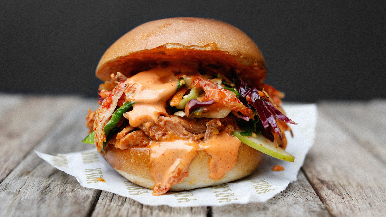
Recognising an opportunity for BŌL to elevate their pioneering, planty-credentials and open up the potential of the plant-based category, our visual identity and packaging redesign celebrates real food, real people and the real benefits of living a life-more-leafy.
Leveraging an exciting world of food-pleasure and occasion, we built a relatable narrative around the true positives and modern attitudes that plant-based brings to the table.
By activating the graphic ‘smile’ device inherent to the BŌL logo across packaging and communications, we amplified the positive, foodie nature of this less chopping, more chop-chop brand.
Each pillar of the BŌL Pots range has been sensitively evolved to bring a vibrant, distinctive personality to shelf and serve up an unmistakable brand-feel.
With tone-of-voice, typography, photography and colour combining in new ways for the brand – eating the rainBŌL has never looked, or tasted, more delicious.


